Votre panier est actuellement vide !
Catégorie : Excel function
How to use the ATANH() function in Excel
This function returns the inverse hyperbolic tangent of a number. The number must be between -1 and 1 (non-inclusive).
Syntax
ATANH(number)Argument
- number(required) – Any real number strictly between -1 and 1 (-1 < number < 1)
Background
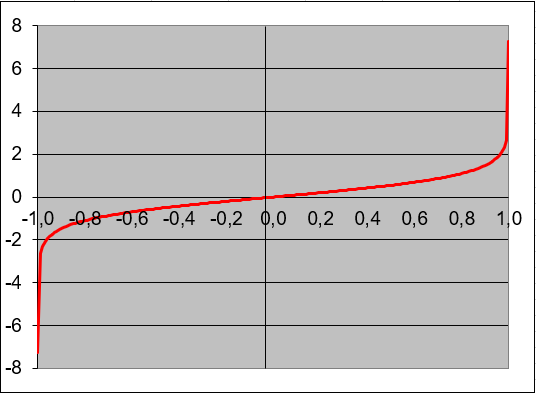
The ATANH() function is the inverse of the hyperbolic tangent (TANH) function. The mathematical formula is:ATANH(x) = 0.5 * ln((1 + x)/(1 – x))
Key Properties:
- Domain: -1 < x < 1
- Range: All real numbers (-∞ to +∞)
- Special Values:
- ATANH(0) = 0
- Approaches ±∞ as x approaches ±1
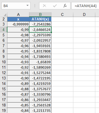
Examples:
Applications:
- Statistics (Fisher transformation)
- Physics (relativity calculations)
- Engineering (signal processing)
- Financial mathematics
HOW TO CREATE SPEEDOMETER GRAPH
SPEEDOMETER GRAPH
When it comes to presenting data in an understandable way in Excel, charts stand out. And few charts are specific and can be used to present a specific type of data.
I’m going to show you exactly how to create a SPEEDOMETER in Excel. It’s also one of the most controversial classifications, so we’ll explore it in every way so you can use it in your Excel dashboards when they’re really needed.
1 What is a SPEEDOMETER graph?
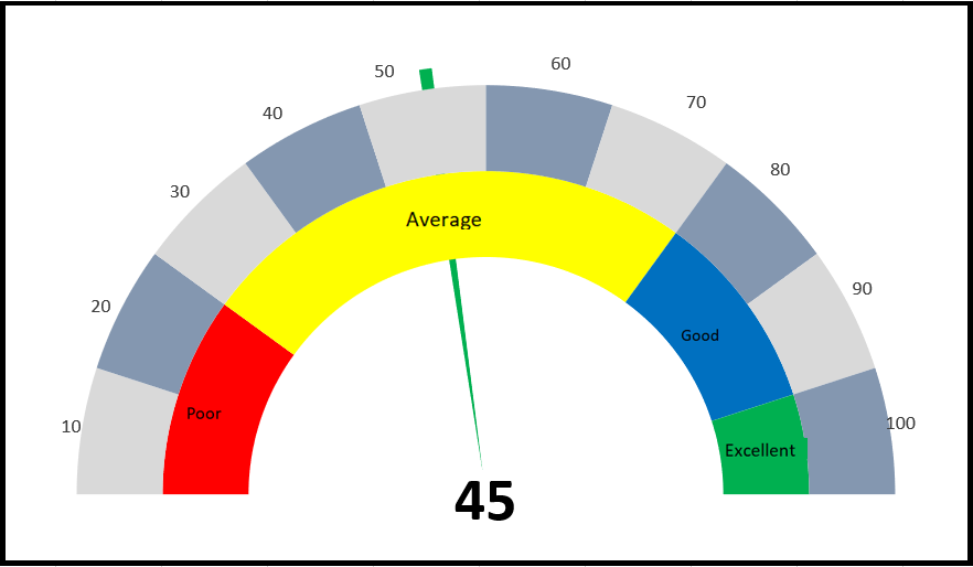
An Excel SPEEDOMETER chart is like a speedometer with a needle that tells you a number by pointing it on the gauge and this needle moves when there is a change in the data . This is a single point chart that helps you track a single data point against its target.
2 Steps to Create a SPEEDOMETER
Here are the steps to create a SPEEDOMETER in Excel that you need to follow.
As I said, we need to insert two doughnut charts and one pie chart, but before we start creating a SPEEDOMETER, you need to organize the data for it.
In the spreadsheet below, we have three different data tables (two for the doughnut charts and one for the pie chart).
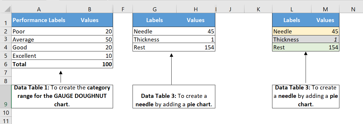
The first data table is to create the category range for the final SPEEDOMETER, which will help you understand the performance level.
The second data table is used to create labels ranging from 0 to 100. You can modify it if you want to have a different range.
And in the third data table , we have three values that we will use to create the pie chart for the needle. The pointer value is the actual value you want to track.
To create a SPEEDOMETER in Excel, you can follow the steps below:
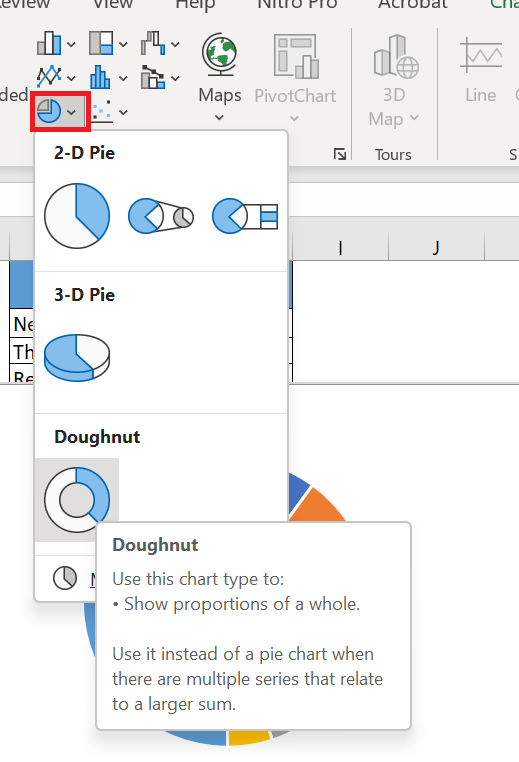
- First, go to Insert I insert in the graphics group, select donut chart ( with this you will get a blank chart ).
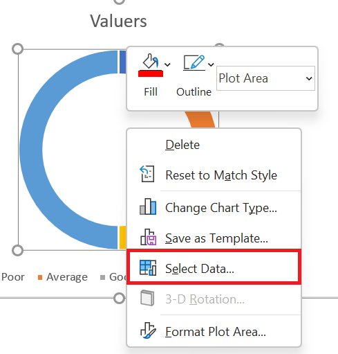
- Now right click on the chart and then click on « Select Data ».
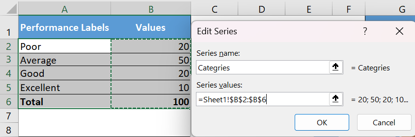
- Data » window , click « Add » and type « Category » in the name input bar. After that, select the « Value » column in the first data table.
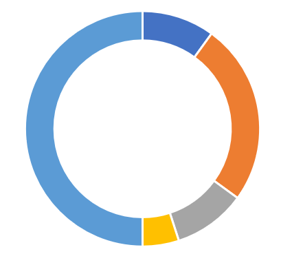
- Once you click OK, you will have a donut chart like below.
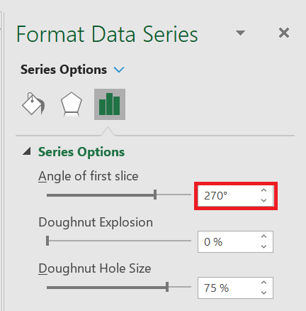
- From here, the next thing to do is to change the angle of the chart and to do this, right-click on the chart and then click on « Format Data Series ».
- In « Data Series Formatting », enter 270° in « First Slice Angle » and press Enter.
- After that, you need to hide below half of the chart. To do this, click only on this part of the chart and open « Format Data Point » and select « No Fill ».
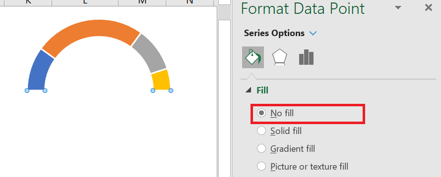
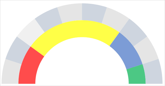
- For the remaining four data points, I used four different colors (red, yellow, blue, and green). At this point, you will have a chart like the one below, and the next step is to create the second doughnut chart to add labels.

- Now right click on the chart and then click on « Select Data ».
- In the « Select Data Source » window, click « Add » to enter a new « Legend Entry » and select the « Values » column in the second data table.
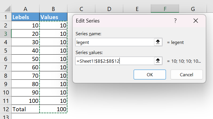
- Once you click OK, you will have a donut chart like below.
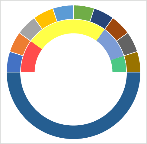
- Again, you need to hide the bottom half of the chart using « No Fill » for the color and I also added a color scheme for the labels. After that, you will have a table like below. Now, the next thing is to create a pie chart with a third data table to add the needle.
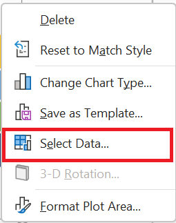
- To do this, right-click on the chart and then click on “Select data”.
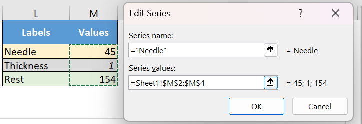
- In the « Select Data Source » window, click « Add » to enter a new « Legend Entry » and select the « Values » column in the third data table.
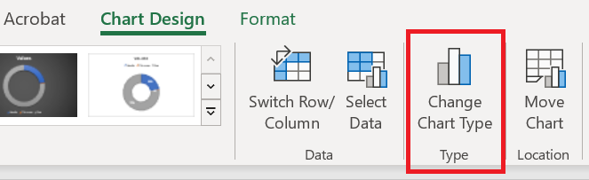
- After that, select the chart and go to Chart Tools ➜ Design Tabs ➜ Change Chart Type .
- In the « Change Chart Type » window, select the Pie chart for « Needle » and click OK.
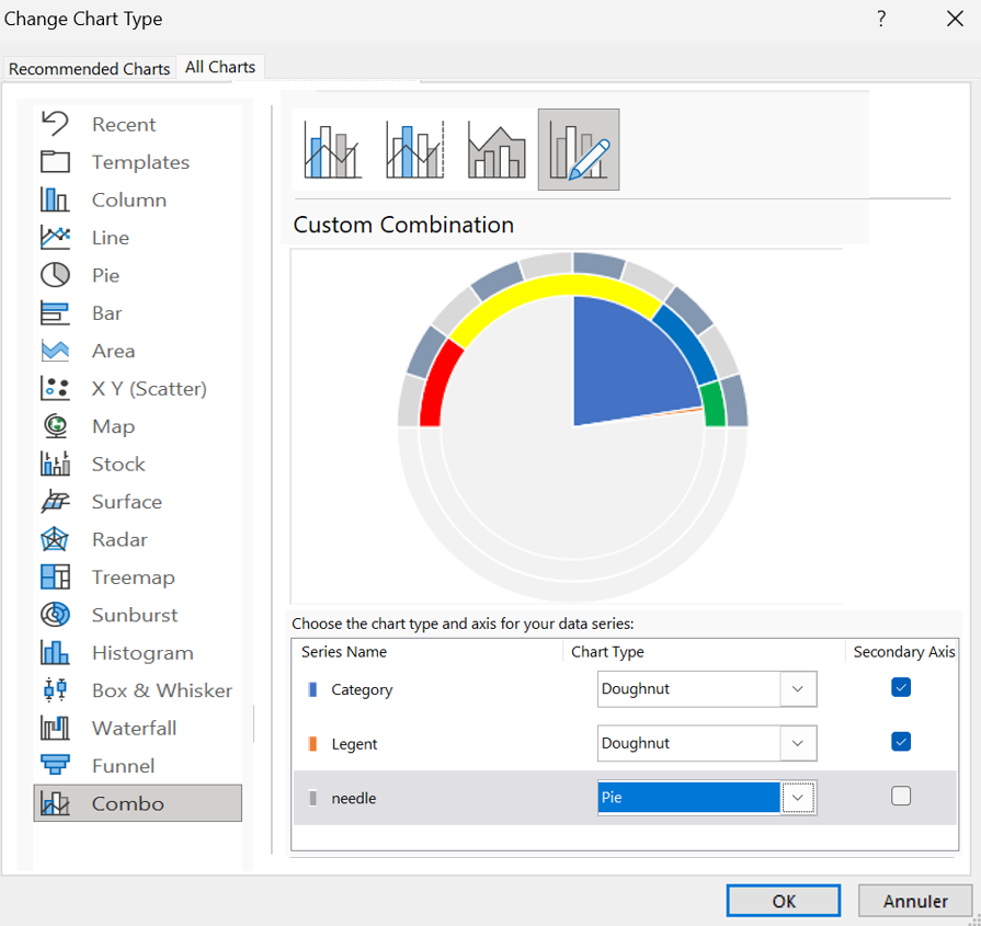
- At this point you have a table like below.
Note : If after selecting a pie chart the angel is not correct (there is a chance), make sure to change it to 270.
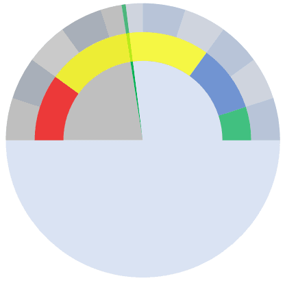
- Now select the two large data parts of the chart and don’t apply any fill color to them to hide them.
- After that, you will only have the small part of the circular diagram left which will be our needle for the SPEEDOMETER.
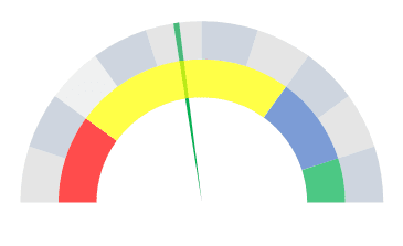
- Next, you need to get this needle out of the table so that it can be easily identified.
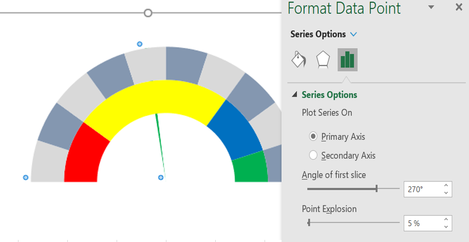
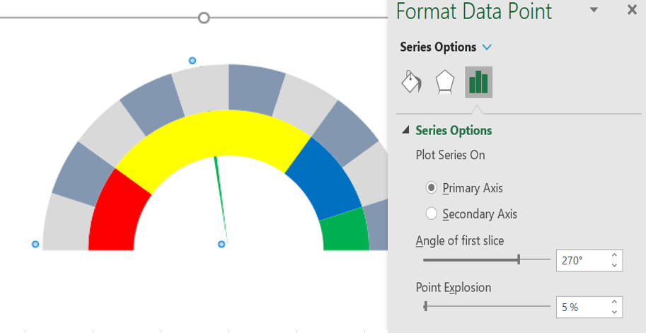
- To do this, select the needle and right-click on it, then click « Format Data Point ».
- In « Format Data Points », go to » Series Options » and add 5% to « Point Spacing ». At this point, you have a ready-to-use SPEEDOMETER (as below), one final touch is required and this last thing is to add data labels and we have to do it one by one for the three graphs.
- First, select the category table and add data labels by right-clicking ➜ Add Data Labels ➜ Add Data Labels .
- Now select the data labels and open « Format Data Label » and after that click on « Cell Values ».
- From there, select the performance label in the first data table, then uncheck “Values”.
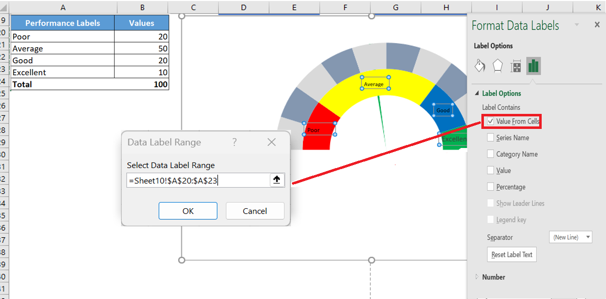
- After that, select the label chart and do the same with it by adding labels from the second data table.
- And finally, you need to add a custom data label for the needle (this is the most important part).
- To do this, insert a text box and select it, then in the formula bar, enter « = » and select the cell with the needle values, press ENTER.
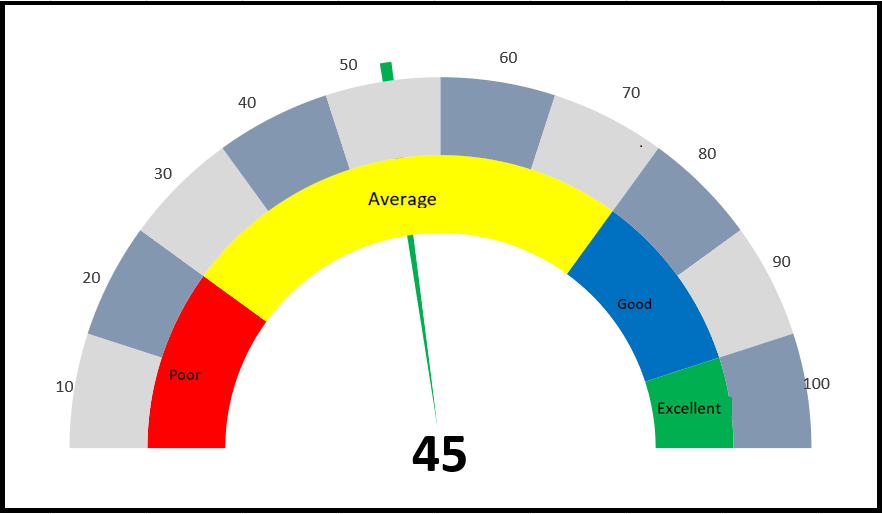
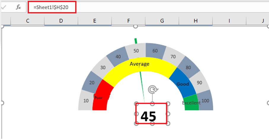 29. At the end, you need to move all the data labels to the end corners, like below:
3 When to use a SPEEDOMETER chart?
As I said, this is one of the most controversial charts. You can find many people saying not to use a SPEEDOMETER or GAUGE chart in your dashboards.
I have listed some of the points that can help you decide when you can use this table and when you should avoid it.
1. Tracking a single data point
As we know, using a SPEED can only be relevant (like customer satisfaction rate) when you need to track a single data point. So if you need to track data (like sales, production) where you have more than one point, there is no way to do it.
2. Only data from the current period
This is another important point to pay attention to when choosing a SPEEDOMETER for your dashboard or KPI reports, as you can only present current data on it. For example, if you use it to present customer satisfaction rate, you can only display the current rate.
3. Easy to understand but time-consuming to create
As I said, a SPEEDOMETER is a single data point graph, so it is quite focused and can be easily understood by the user.
But you have to spend a few minutes to create it because it is not there in Excel by default.
Conclusion
A SPEEDOMETER or GAUGE chart is one of the most commonly used charts in KPIs and dashboards. Even so, you can find many people who don’t like using it at all.
But this is one of those charts that can help you make your dashboards look cool.
How to use the ATAN2() function in Excel
Its returns the arctangent angle (in radians) between the x-axis and a line from the origin (0,0) to the specified (x,y) coordinates. Unlike ATAN(), this function determines the correct quadrant for the angle.
Syntax
ATAN2(x_num ; y_num)Arguments
Argument Required Description x_num Yes The x-coordinate of the point y_num Yes The y-coordinate of the point Key Features:
- Output Range: -π to π radians (-180° to 180°)
- Conversion to Degrees:
DEGREES(ATAN2(x_num ;y_num))
- Special Cases:
- Returns #DIV/0! if both arguments are 0
- Handles x=0 cases (unlike ATAN(y/x))
Behavior by Quadrant:
Quadrant x_num y_num Result Range I + + 0 to π/2 (0° to 90°) II – + π/2 to π (90° to 180°) III – – -π to -π/2 (-180° to -90°) IV + – -π/2 to 0 (-90° to 0°) 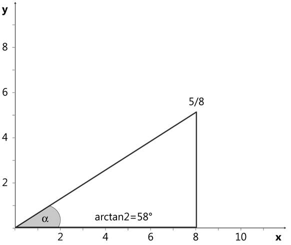
Example:

Comparison with ATAN():
Feature ATAN2() ATAN() Inputs Separate x,y coordinates Single ratio (y/x) Range -π to π (-180° to 180°) -π/2 to π/2 (-90° to 90°) Handles x=0 Yes No Quadrant Awareness Yes No Note: For accurate angle calculations in all four quadrants, ATAN2() is preferred over ATAN() as it automatically adjusts for the correct quadrant based on the signs of both coordinates.
How to use the ASINH() function in Excel
This function returns the inverse hyperbolic sine of a number .
Syntax
ASINH(number)Argument
- number(required) – Any real number
Background
The inverse hyperbolic sine is the inverse function of the hyperbolic sine. The mathematical formula for the inverse hyperbolic sine (sinh⁻¹) is:ASINH(x) = ln(x + √(x² + 1))
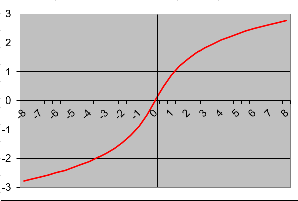
Key Properties:
- Defined for all real numbers (-∞ to +∞)
- Output range is unrestricted (-∞ to +∞)
- The function is odd: ASINH(-x) = -ASINH(x)
- Returns values in radians
Examples:
- =ASINH(0)returns 0
- =ASINH(1)returns 0.88137359
- =ASINH(-1)returns -0.88137359

Applications:
- Physics (relativity and wave equations)
- Engineering (signal processing)
- Statistics (transformations of data)
- Geometry (hyperbolic space calculations)
How to use the AGGREGATE() function in Excel
This function returns an aggregate calculation from a list or database.
Syntax. This function has two forms:
AGGREGATE(function_num; options; ref1; [ref2]; …) (reference form)
AGGREGATE(function_num; options; array; [k]) (array form)Arguments
- function_num (required)
A number between 1 and 19 that specifies the aggregation function (see Table 1).
Table 1. Function Numbers and Corresponding Functions
function_num Function 1 AVERAGE() 2 COUNT() 3 COUNTA() 4 MAX() 5 MIN() 6 PRODUCT() 7 STDEV.S() 8 STDEV.P() 9 SUM() 10 VAR.S() 11 VAR.P() 12 MEDIAN() 13 MODE.SNGL() 14 LARGE() 15 SMALL() 16 PERCENTILE.INC() 17 QUARTILE.INC() 18 PERCENTILE.EXC() 19 QUARTILE.EXC() - options (required)
A numerical value that determines which values to ignore (see Table 2).
Table 2. Option Values and Behaviors
option Behavior 0 Ignores nested SUBTOTAL()/AGGREGATE() 1 Ignores hidden rows + nested functions 2 Ignores errors + nested functions 3 Ignores hidden rows, errors, nested functions 4 Ignores nothing 5 Ignores hidden rows only 6 Ignores errors only 7 Ignores hidden rows and errors - ref1 (required for reference form)
The first numeric argument or range for aggregation. - ref2/k (optional)
- Reference form: Additional arguments (up to 253).
- Array form: Required for:
- LARGE(array, k)
- SMALL(array, k)
- PERCENTILE.INC(array, k)
- QUARTILE.INC(array, quart)
- PERCENTILE.EXC(array, k)
- QUARTILE.EXC(array, quart)
Background. The AGGREGATE() function is a powerful tool introduced in Excel to overcome limitations of other functions. Unlike standard functions that return errors for invalid references, AGGREGATE() provides flexible control over hidden cells and error handling without complex IFERROR() workarounds. It can calculate ranges containing subtotals while excluding them from results (see Figure below).
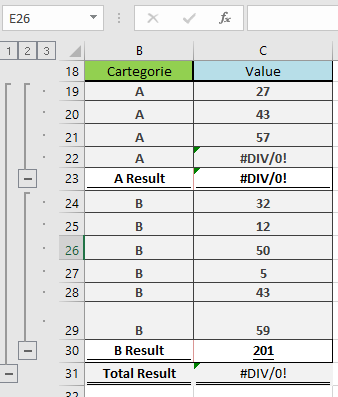
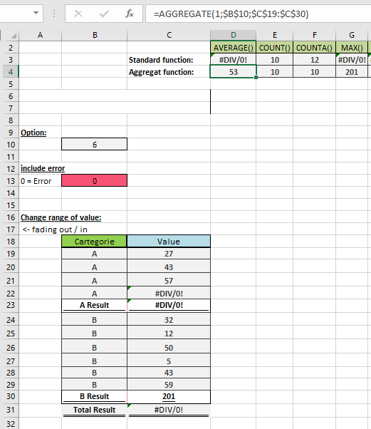
Example. the figure below show an example on aggregate function in excel
- function_num (required)
How to use the ACOSH() function in Excel
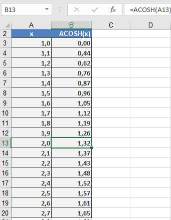
This function returns the inverse hyperbolic cosine of a number (see Figure below). The definition range spans x = +1 to +∞.
Syntax
ACOSH(number)Argument
- number(required) – A real number equal to or greater than 1.
Background
The inverse hyperbolic functions are also called the area hyperbolic functions. They are the inverse functions of the hyperbolic functions. The hyperbolic functions sinh, tanh, and coth are strictly monotonic and have one inverse function. The cosh function, however, has two monotonic intervals symmetrical to the positive segment of the ordinate and two inverse functions:- y = arcosh x
- y = -arcosh x
where:

The graph (see Figure below) starts at point 1.0 and is monotone increasing or decreasing.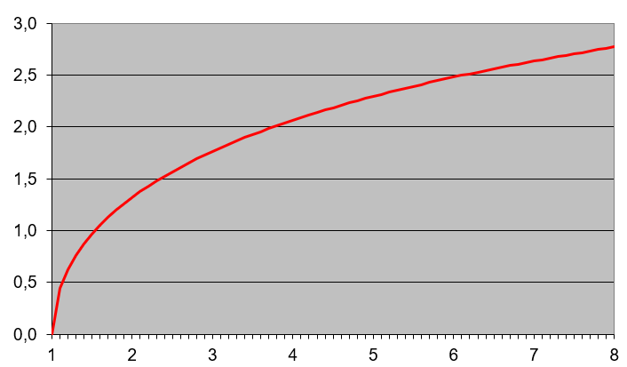
Example
Two parallel wires with the diameter d, length l, and distance a have the capacitance C.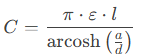
ε = ε₀ εᵣ is the permittivity of the medium. More examples of this function are:
- =ACOSH(1)returns 0.
- =ACOSH(2)returns 1,32.
How to use the YIELDDISC() function in Excel
Its calculates the annual yield of a discounted security (e.g., Treasury bills or commercial paper) that pays no periodic interest but is issued at a discount and redeemed at face value.
Syntax
YIELDDISC(Settlement; Maturity; Price; Redemption; [Basis])
Arguments
Argument Required Description Validation Rules Settlement Yes Purchase date of the security. Must be valid date < Maturity. Maturity Yes Maturity/redemption date. Must be valid date > Settlement. Price Yes Purchase price per $100 face value. Must be positive and < Redemption. Redemption Yes Redemption value per $100 face value. Typically 100. [Basis] No Day-count convention (0-4). Default=0. See Table 15-2. Error Conditions
- #VALUE!: Invalid dates.
- #NUM!: If:
- Price ≤ 0 or ≥ Redemption
- Settlement ≥ Maturity
- Basis ∉ {0,1,2,3,4}
Key Formula

Where:
- Days_in_Year: 360 (Basis=0,2,4) or 365 (Basis=1,3).
- Days_to_Maturity: Actual calendar days between Settlement and Maturity.
Examples
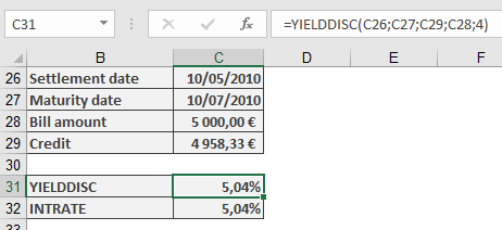
- Bill of Exchange (Supplier Loan)
Scenario:
- Face Value: $5,000
- Purchase Price: $4,958.33 (5% discount)
- Settlement: 10-May-2010
- Maturity: 10-Jul-2010 (61 days)
- Basis: 4 (European 30/360)
Calculation:
=YIELDDISC(« 5/10/2010 », « 7/10/2010 », 4958.33, 5000, 4)
Result: 5.04% annual yield.
Background
- Discount vs. Yield:
- Discount Rate: Anticipative interest (applied upfront).
- Yield: Equivalent interest-in-arrears return.
- Day-Count Conventions:
Basis Method Year Days 0 US (NASD) 30/360 360 1 Actual/actual 365/366 2 Actual/360 360 3 Actual/365 365 4 European 30/360 360 - Comparison with RECEIVED():
- YIELDDISC() solves for yield given price.
- RECEIVED() solves for maturity value given yield.
How to use the YIELD() function in Excel
Its calculates the annual yield of a fixed-interest security (bond) given its price, coupon rate, and maturity date. This represents the effective return an investor would earn if the bond is held to maturity.
Syntax
YIELD(Settlement; Maturity; Rate; Price; Redemption; Frequency; [Basis])
Arguments
Argument Required Description Validation Rules Settlement Yes Bond purchase date. Must be valid date < Maturity. Maturity Yes Bond maturity/redemption date. Must be valid date > Settlement. Rate Yes Annual coupon rate (decimal). ≥ 0 (e.g., 5% = 0.05). Price Yes Bond price per $100 face value. > 0 (e.g., 95.50 for $95.50). Redemption Yes Redemption value per $100 face value. Typically 100. Frequency Yes Coupon payments per year:
1 = Annual
2 = Semi-annual
4 = Quarterly.∈ {1, 2, 4}. [Basis] No Day-count convention (0-4). Default=0. See Table 15-2. Error Conditions
- #VALUE!: Invalid dates.
- #NUM!: If:
• Rate < 0 or Price ≤ 0
• Frequency ∉ {1, 2, 4}
• Basis ∉ {0, 1, 2, 3, 4}
• Settlement ≥ Maturity.
Key Formula
Solves for Yield (y) in:

Where:
- f = Frequency
- k = Period number
- N = Total periods
Examples
- Annual Coupon Bond
Scenario:
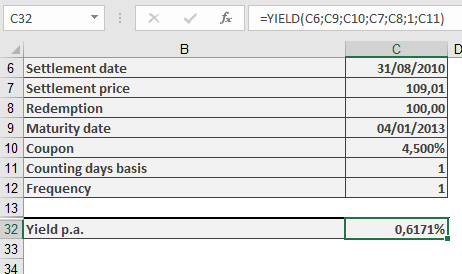
- Settlement: 31-Aug-2010
- Maturity: 4-Jan-2013
- Coupon Rate: 4.5%
- Price: $109.01 (per $100 face value)
- Redemption: $100
- Frequency: 1 (annual)
- Basis: 1 (Actual/actual)
Calculation:
=YIELD(« 8/31/2010 », « 1/4/2013 », 0.045, 109.01, 100, 1, 1)
Result: 0.617% annual yield.
ISMA Yield Conversion:
=EFFECT(YIELD(…), 2)
Background
- Day-Count Conventions:
Basis Method 0 US (NASD) 30/360 1 Actual/actual 2 Actual/360 3 Actual/365 4 European 30/360 - Yield Types:
- Current Yield: Coupon/Price (simpler but less accurate).
- Yield to Maturity (YTM): Total return (what YIELD() calculates).
- Market Dynamics:
- Price < 100 → Yield > Coupon Rate (discount bond).
- Price > 100 → Yield < Coupon Rate (premium bond).
How to use the XNPV() function in Excel
Its calculates the net present value (NPV) of a series of cash flows occurring at irregular intervals, discounted at a specified annual rate. Unlike standard NPV, XNPV uses exact dates for precise time-adjusted valuation.
Syntax
XNPV(Rate; Values; Dates)
Arguments
Argument Required Description Validation Rules Rate Yes Annual discount rate (e.g., 10% = 0.10). Must be numeric. Values Yes Array of cash flows:
• Negative: Outflows (costs)
• Positive: Inflows (income).Must include ≥1 positive and ≥1 negative value. Dates Yes Exact dates corresponding to each cash flow. Dates must align with Values array; first date = start point. Error Conditions
- #VALUE!: Invalid date format.
- #NUM!: If:
• Dates/Values arrays mismatch in size
• All cash flows are positive/negative
• Dates are non-chronological.
Key Formula
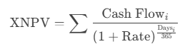
Where Days = Exact days from the first date in the series.
Example: Evaluating Discount Terms
Scenario:
A dealer offers payment terms with discounts for early payment. Compare against a 10% annual investment yield.Cash Flows:
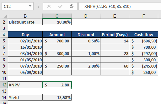
Calculation:
Effective Yield (XIRR Verification):
=XIRR({-696.5, -297, -245, 700, 300, 250}, {« 1/2/2010 », « 4/3/2010 », « 7/7/2010 », « 1/16/2010 », « 5/1/2010 », « 9/7/2010 »})
Result: 13.58% (beats 10% alternative).
Why Use XNPV?
- Precision: Accounts for exact days between cash flows (e.g., 14 days vs. « 1 month »).
- Flexibility: Evaluates irregular income/expenditures (e.g., project milestones, custom payment plans).
- Decision Tool:
- Positive NPV: Project/investment adds value.
- Negative NPV: Reconsider or adjust terms.
Comparison with NPV
Feature XNPV NPV Timing Exact dates Equal intervals Formula Daily compounding (365) Periodic compounding Use Case Leases, trade credit Annuities, loans How to use the XIRR() function in Excel
Its calculates the internal rate of return (IRR) for a series of cash flows with irregular timing, providing the annualized effective return rate.
Syntax
XIRR(Values; Dates; [Guess])
Arguments
Argument Required Description Validation Rules Values Yes Array of cash flows (positive for inflows, negative for outflows). Must include at least one positive and one negative value. Dates Yes Corresponding dates for each cash flow. Dates must be in chronological order after the first date. [Guess] No Initial estimate for IRR (default=10%). Helps convergence in complex scenarios. Error Conditions
- #VALUE!: Invalid date format.
- #NUM!: If:
- Dates not chronological
- Mismatched array sizes
- No solution found (e.g., all positive/negative cash flows)
Background
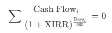
XIRR extends the classic IRR by accommodating irregular intervals, using daily compounding based on a 365-day year. It solves for the discount rate that sets the net present value (NPV) of cash flows to zero:
Examples
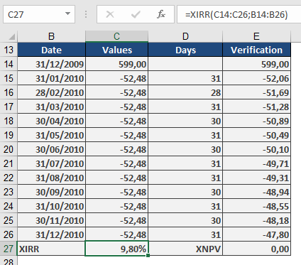
- Consumer Loan Evaluation
Scenario:
- Washing machine: $599 (initial outflow, entered as -599)
- 12 monthly payments: $52.48 (inflows, entered as +52.48)
Calculation:
=XIRR({-599, 52.48, 52.48, …, 52.48}, {« 1/1/2023 », « 2/1/2023 », …, « 12/1/2023 »})
Result: 9.8% effective annual rate.
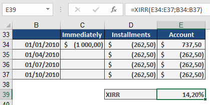
- Insurance Premium Financing
Scenario:
- Annual premium: $1,000
- Quarterly alternative: 4 payments of $262.50
Calculation:
=XIRR({737.50, -262.50, -262.50, -262.50, -262.50}, {« 1/1/2023 », « 4/1/2023 », « 7/1/2023 », « 10/1/2023 », « 1/1/2024 »})
Result: 14.2% implied annual cost.
Key Features
- Real-World Applicability:
- Evaluates loans, investments, or leases with flexible payment schedules.
- Adjusts for exact calendar days (e.g., 28-day vs. 31-day months).
- Comparison Tool:
- Compare financing options (e.g., lump-sum vs. installments).
- Annualizes returns for irregular cash flows (e.g., venture capital).
- Limitations:
- Requires at least one inflow and one outflow.
- May fail with highly irregular cash flows (adjust Guess if needed).